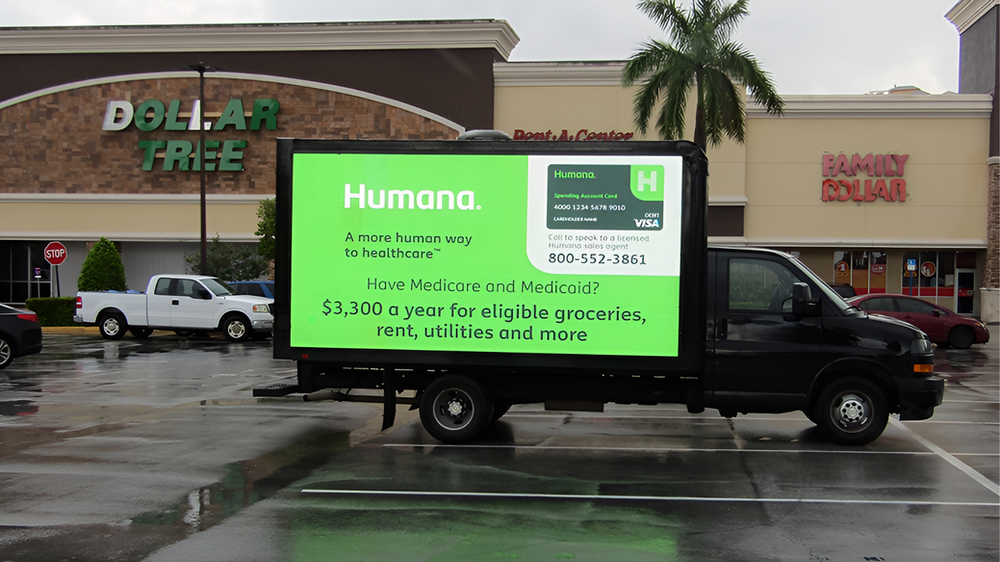
Start with one message
Decide what the viewer should remember after the truck is gone. That idea should drive the headline, image, and call to action. Multiple offers, long lists, and competing messages make every part weaker.
Write for a glance
Keep the main headline short. Use plain words, strong hierarchy, and large type. If the message cannot be understood in a few seconds, reduce it. A billboard is not a brochure and should never look like a flyer enlarged onto a screen.
Use contrast aggressively
Bright text on a dark field—or dark text on a bright field—usually reads better than subtle colors and busy photography. Protect clear space around the headline and logo. Test the design at thumbnail size: if it disappears, it will struggle at a distance.
Make the brand unmistakable
Use a clear logo, brand color, product image, or visual cue. The viewer should not have to search for the advertiser. Familiarity compounds when the same visual system appears on the truck, postcards, landing page, and social campaign.
Choose one next step
Use a memorable URL, short phone number, simple offer, or QR code when the viewing environment supports it. Keep the instruction direct: Visit, Scan, Call, Book, Shop, or Learn More. Avoid placing several competing actions on one frame.
Design for the full truck
The side and rear panels can work together without repeating the exact same layout. The side may carry the strongest visual while the rear reinforces the offer for drivers behind the truck. In an exclusive campaign, rotating creative can introduce the brand, present the benefit, and close with the action.
Final preflight checklist
- Can the headline be read in seconds?
- Is the brand obvious?
- Is there one dominant visual?
- Does the design have enough contrast?
- Is the action simple and memorable?
- Has the creative been checked at both full size and thumbnail size?
Bring us the idea.
We can help turn your campaign message into creative built for the street.
Start a Campaign